2024-01-16 21:04:53 +00:00
---
post_title: User Experience Guidelines - Payment Button Style
menu_title: Payment Button Style
---
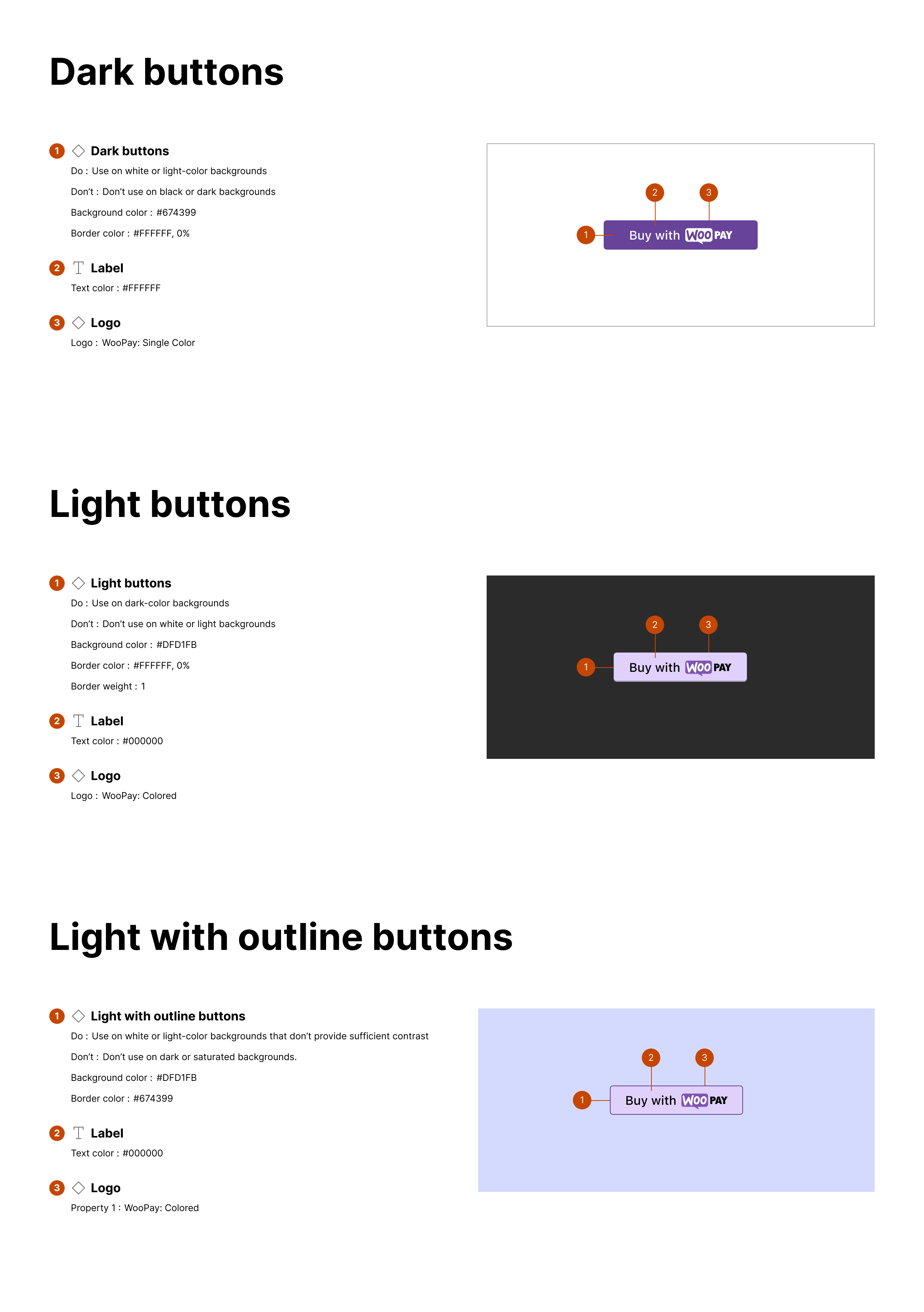
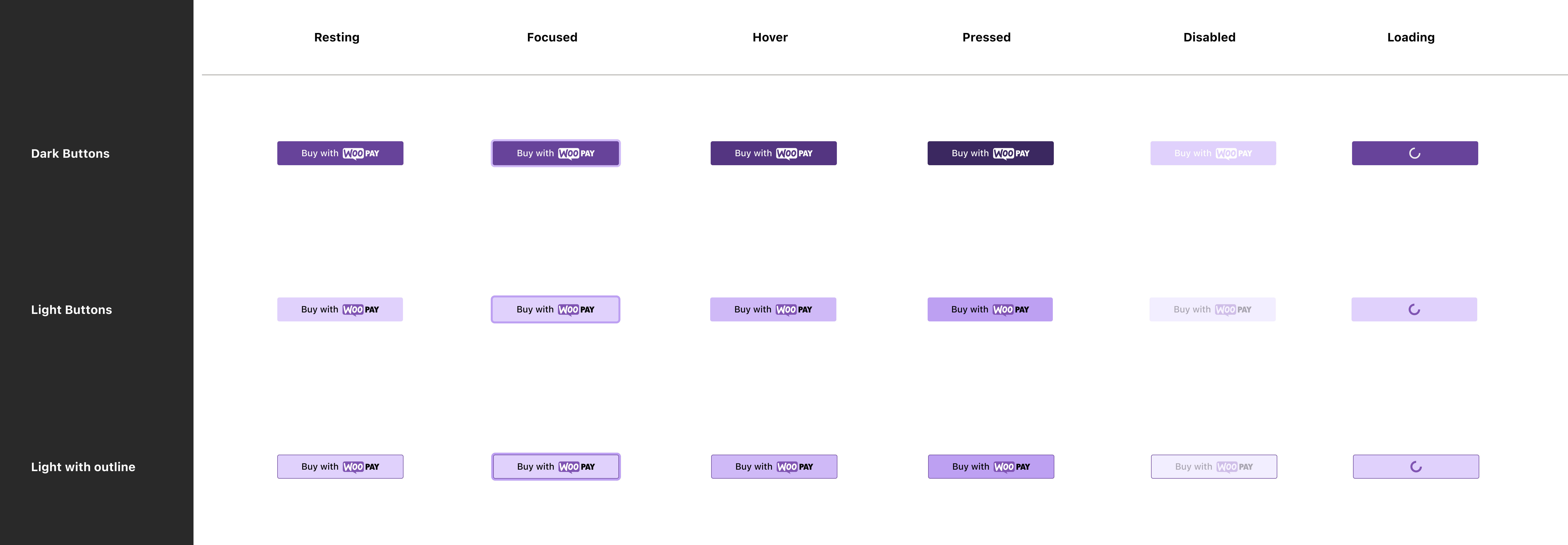
Use the appropriate button style depending on the site theme.
2024-04-09 08:50:15 +00:00
2024-01-16 21:04:53 +00:00
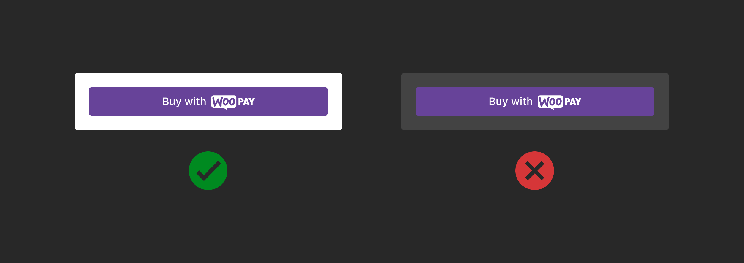
### Dark
2024-03-12 14:14:48 +00:00
Use on white or light-color backgrounds. Don't use on black or dark backgrounds.
2024-01-16 21:04:53 +00:00
2024-04-09 08:50:15 +00:00
2024-01-16 21:04:53 +00:00
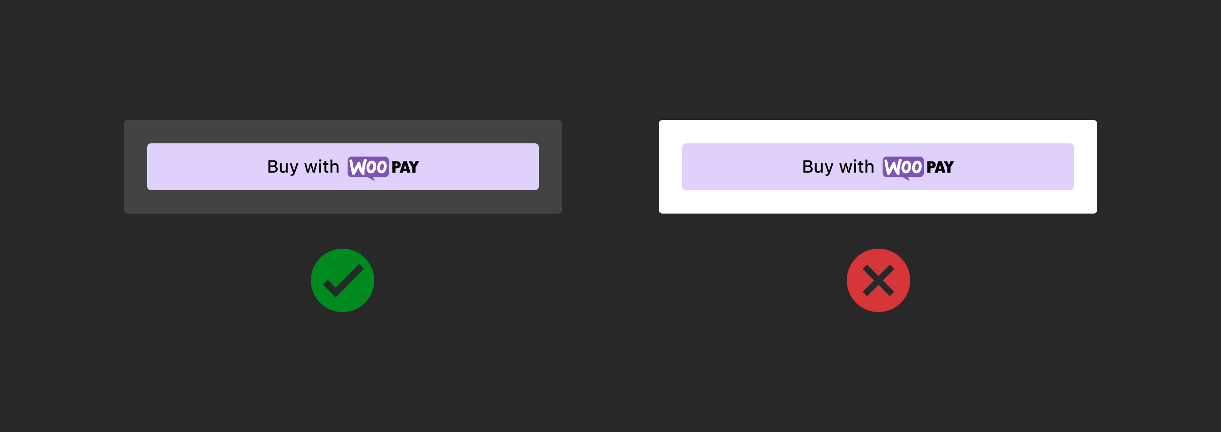
### Light
2024-03-12 14:14:48 +00:00
Use on dark-color backgrounds. Don't use on white or light backgrounds.
2024-01-16 21:04:53 +00:00
2024-04-09 08:50:15 +00:00
2024-01-16 21:04:53 +00:00
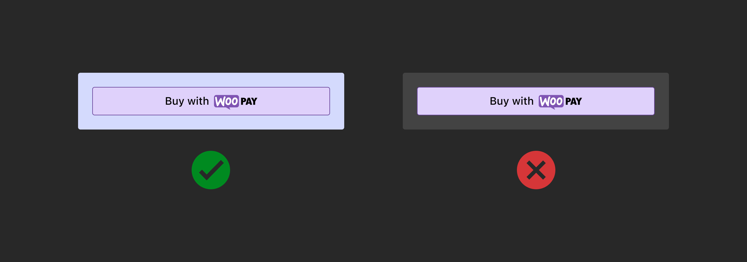
### Light with outline
2024-03-12 14:14:48 +00:00
Use on white or light-color backgrounds that don't provide sufficient contrast. Don't use on dark or saturated backgrounds.
2024-01-16 21:04:53 +00:00
2024-04-09 08:50:15 +00:00
2024-01-16 21:04:53 +00:00
### Button style and specifications
Buttons should contain the following states for resting, loading, active, and loading contexts. For additional guidance, follow the general Woo accessibility guidelines.
2024-04-09 08:50:15 +00:00