 94d8d580a2
* Fix isDefault notice * fix Toolbar to ToolbarGroup |
||
|---|---|---|
| .. | ||
| README.md | ||
| index.js | ||
| screenshot.png | ||
| style.scss | ||
README.md
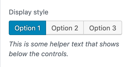
ToggleButtonControl
ToggleButtonControl is used to generate a series of toggle buttons where only one selection is possible. It uses a ButtonGroup component to output each toggle button.
Usage
Render a user interface to select multiple users from a list.
  <ToggleButtonControl
    label={ __( 'Display style', 'woo-gutenberg-products-block' ) }
    value={ isDropdown ? 'dropdown' : 'list' }
    help="This is some helper text that shows below the controls."
    options={ [
      { label: __( 'List', 'woo-gutenberg-products-block' ), value: 'list' },
      { label: __( 'Dropdown', 'woo-gutenberg-products-block' ), value: 'dropdown' },
    ] }
    onChange={ ( value ) => setAttributes( { isDropdown: 'dropdown' === value } ) }
  />
) );
Props
The component accepts the following props:
label
If this property is added, a label will be generated using label property as the content.
- Type:
String - Required: No
help
If this property is added, a help text will be generated using help property as the content.
- Type:
String|WPElement - Required: No
value
If value is passed, one of the options will have pressed state. If no value is passed no button will have pressed state.
- Type:
String - Required: No
onChange
A function that receives the selected value (string) as input.
- Type:
function - Required: Yes
className
The class that will be added with components-base-control and components-toggle-button-control to the classes of the wrapper div. If no className is passed only components-base-control and components-toggle-button-control are used.
Type: String Required: No
options
An array of objects containing the following properties:
label: (string) The label to be shown to the user.value: (Object) The internal value used to choose the selected value. This is also the value passed to onChange when the option is selected.
Type: Array
Required: No