82 lines
2.8 KiB
Markdown
82 lines
2.8 KiB
Markdown
---
|
|
post_title: User Experience Guidelines - Payment Button Size and Anatomy
|
|
menu_title: Payment Button Size
|
|
---
|
|
|
|
Payment buttons must be consistent in visual appearance to other buttons in the shopper experience.
|
|
|
|
Height for payment buttons ranges from 40px (Small) to 56px (Large). The default button height is 48px. The following presets can be used for button height.
|
|
|
|
- Small: Height 40px
|
|
- Default: Height 48px
|
|
- Large: Height 56
|
|
|
|
### Anatomy
|
|
|
|
Payment buttons consist of up to three elements: a button component, payment logo, and optional label.
|
|
[Anatomy.png]
|
|
|
|
Don't place any text outside the surface area of the button.
|
|
|
|
|
|
|
|
### Layout and spacing
|
|
|
|
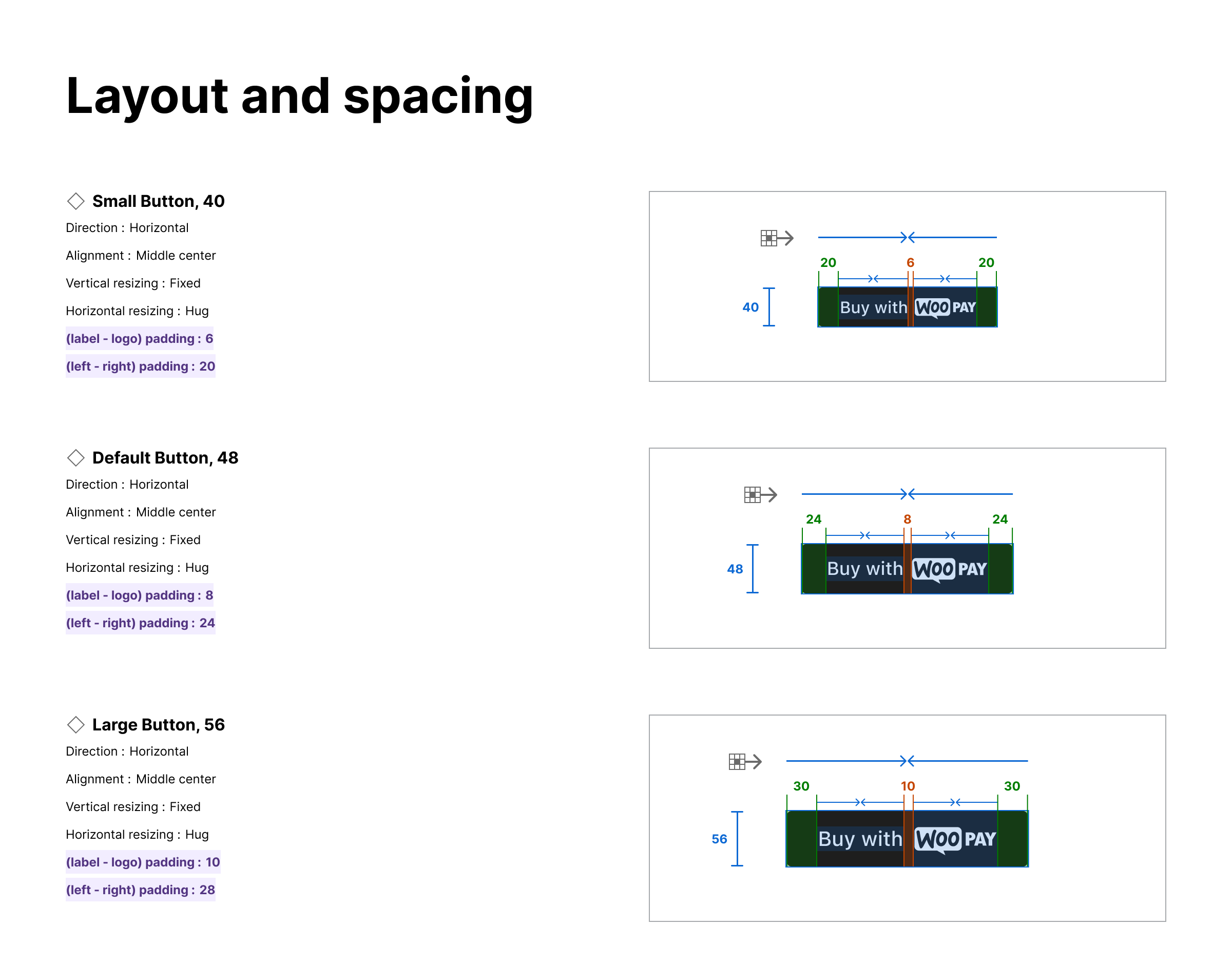
The spacing between and around the Label and Payment Logo adapts based on the size of the button.
|
|
|
|
|
|
|
|
### Adaptive height
|
|
|
|
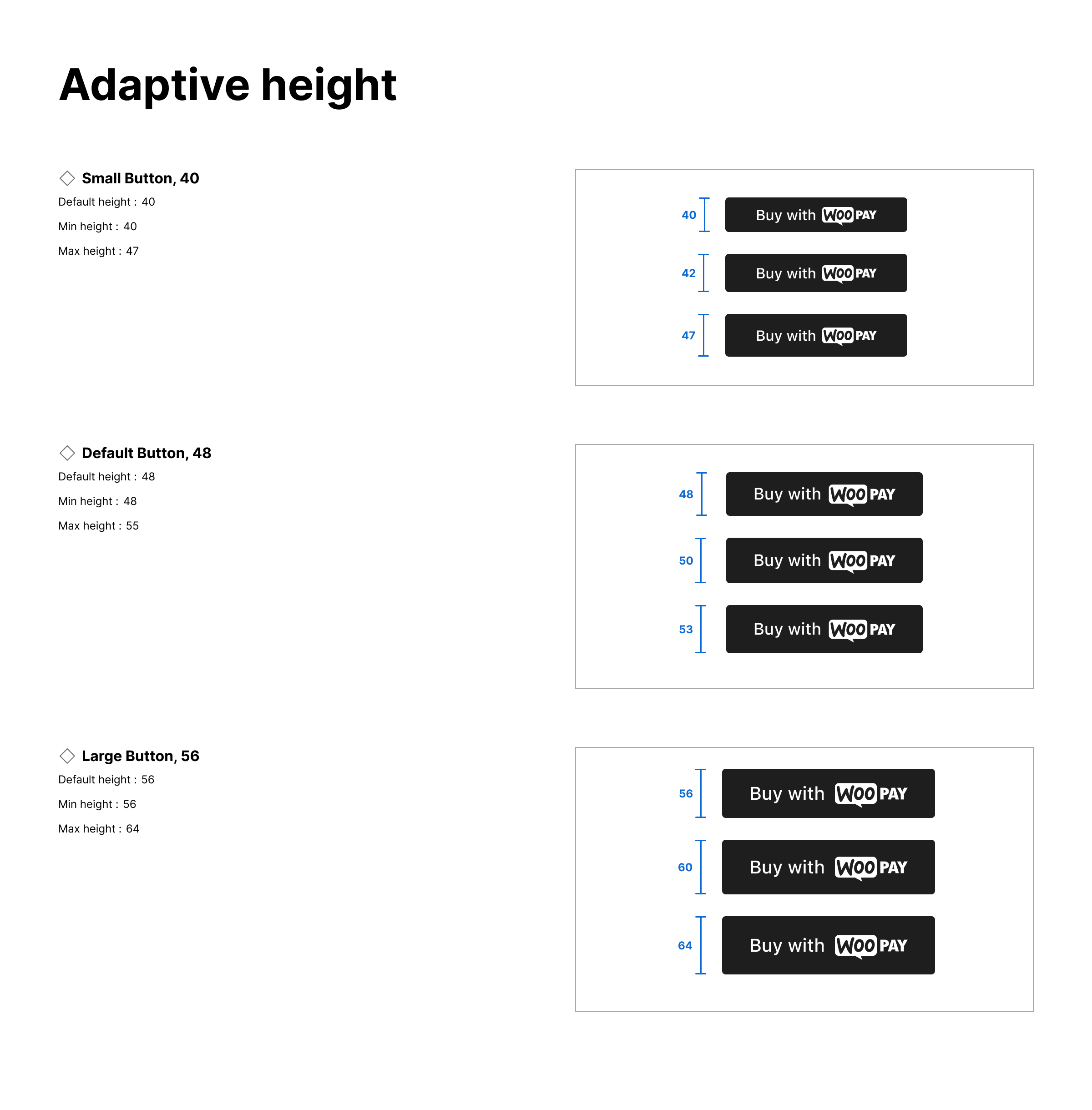
The height of the button can adapt based on the needs of the theme.
|
|
|
|
|
|
|
|
### Button size
|
|
|
|
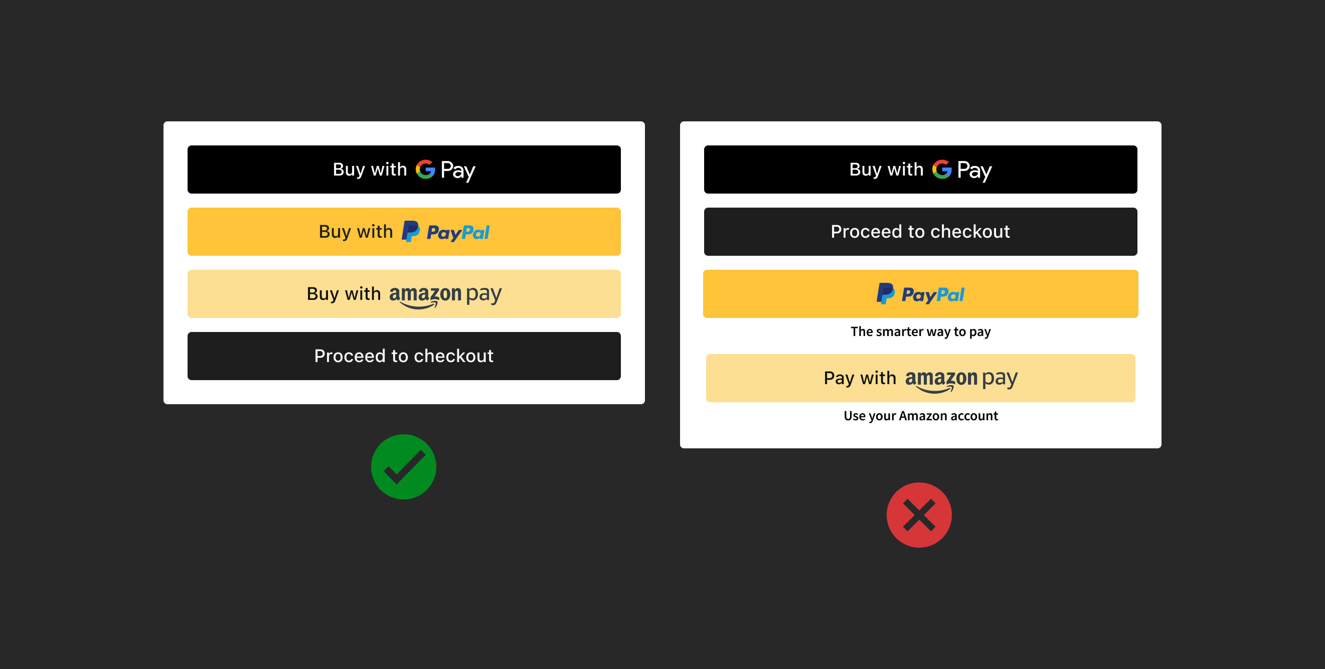
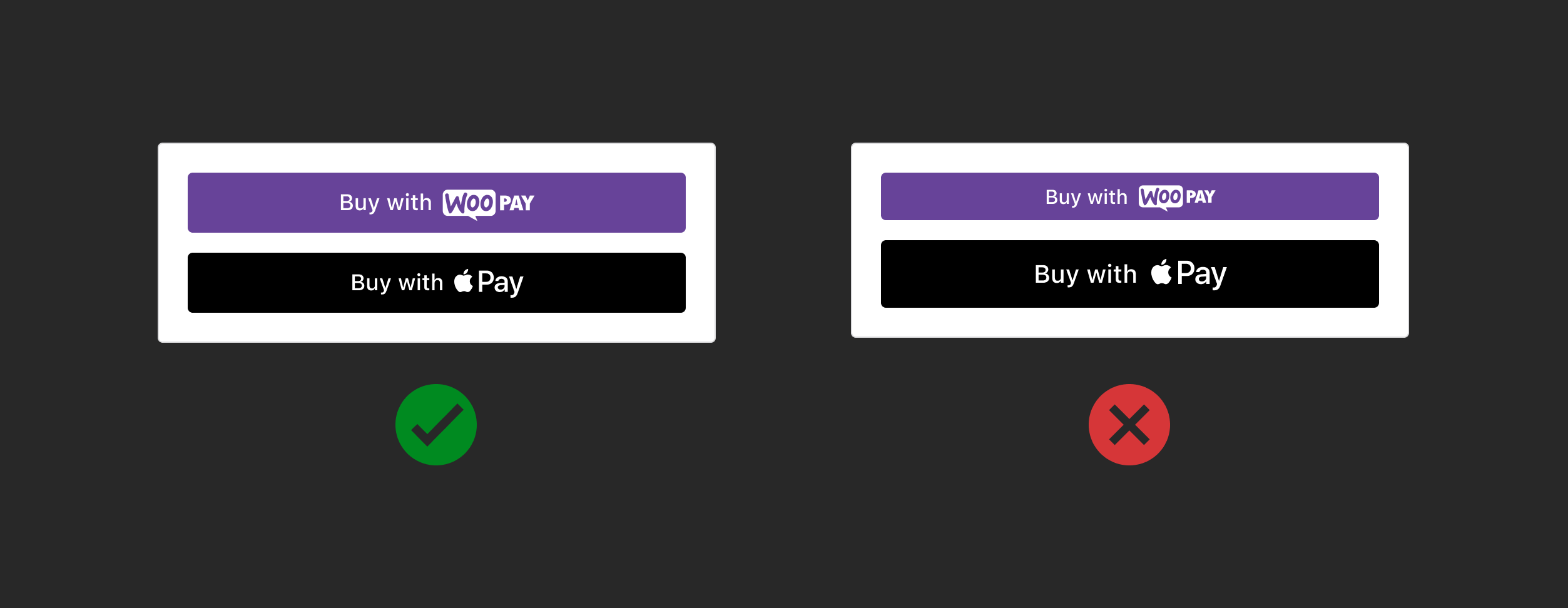
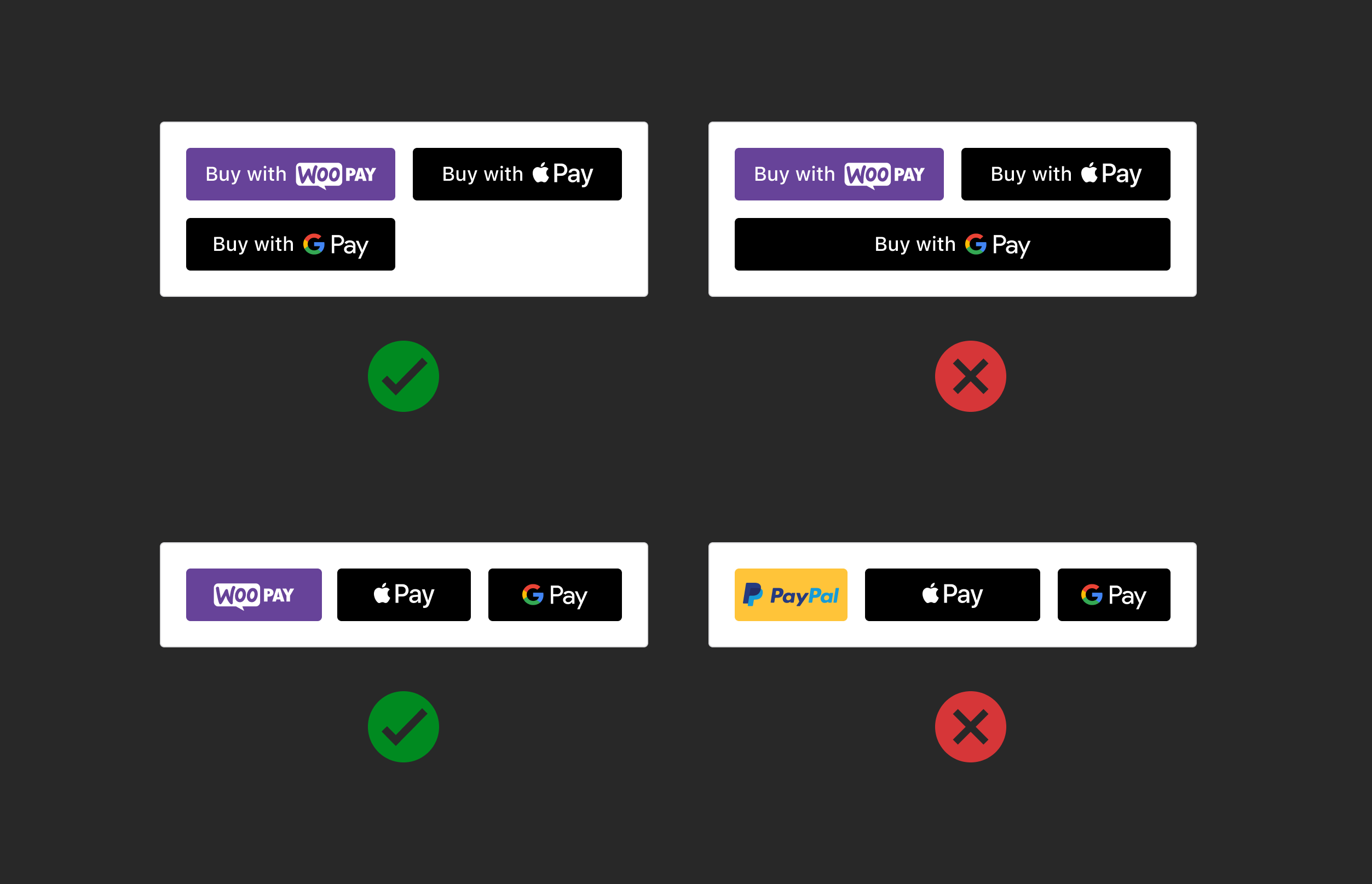
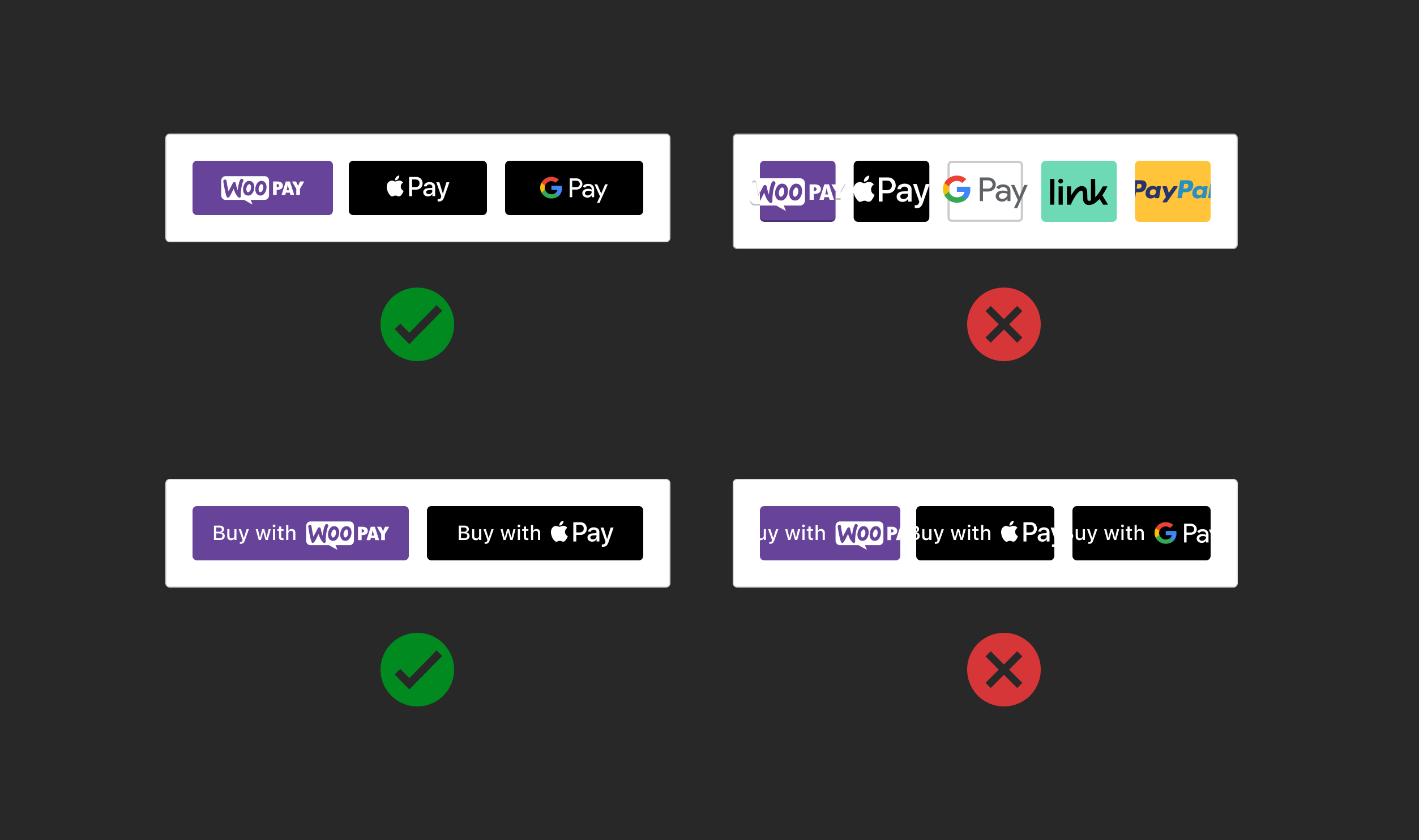
Make payment buttons the same size, no bigger or smaller than other payment buttons, including the CTAs "Add to cart" and "Proceed to checkout"
|
|
|
|
|
|
|
|
### Button width
|
|
|
|
Use the same width size for all payment buttons. Don't make the width larger or smaller than other payment buttons.
|
|
|
|
|
|
|
|
### Minimum width
|
|
|
|
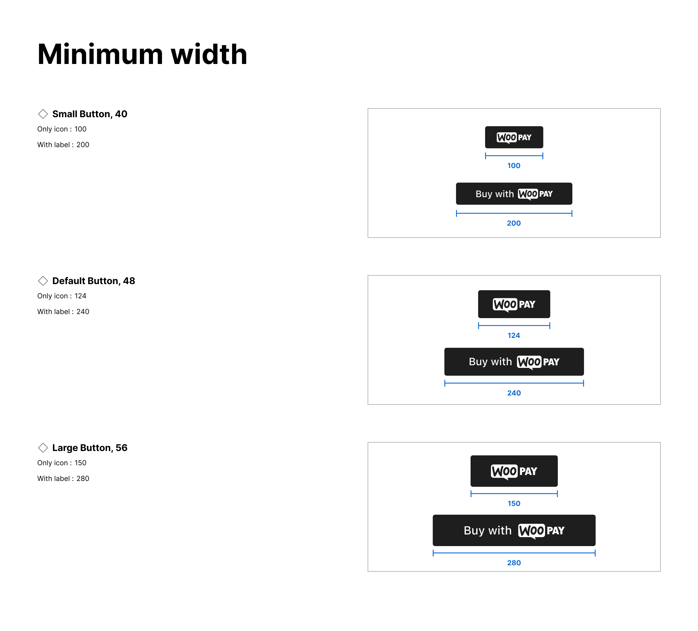
Buttons have a minimum width to ensure readability.
|
|
|
|
|
|
|
|
Follow the minimum width of each payment button size. Don't squeeze payment buttons in a single line.
|
|
|
|
|
|
|
|
### Button Shape
|
|
|
|
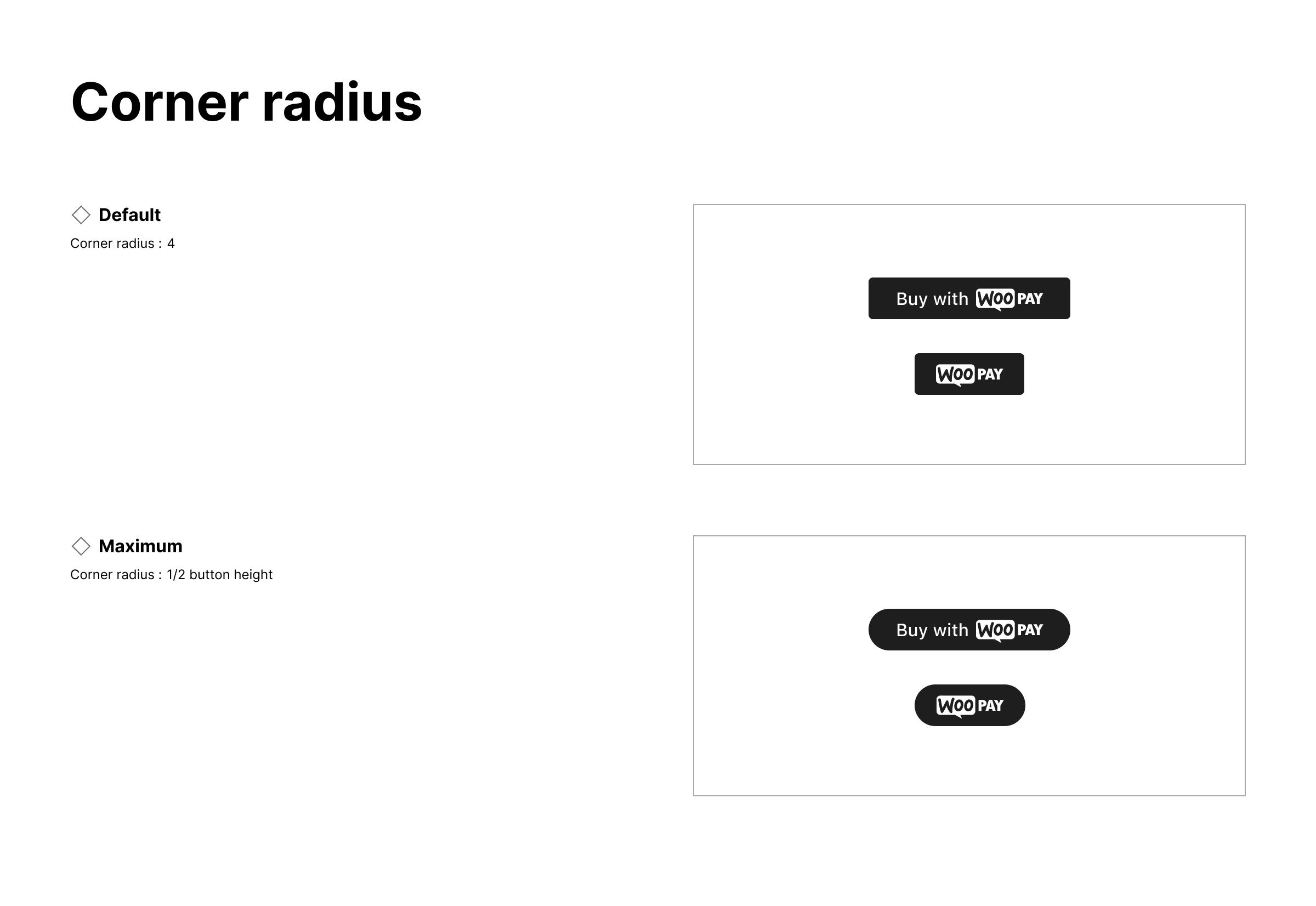
Use the same corner radius for all payment buttons. Don't make the corner radius larger or smaller than other payment buttons.
|
|
|
|
- Default corner radius: 4px
|
|
- Maximum corner radius: ½ button height
|
|
|
|
|
|
|
|
### Button Label
|
|
|
|
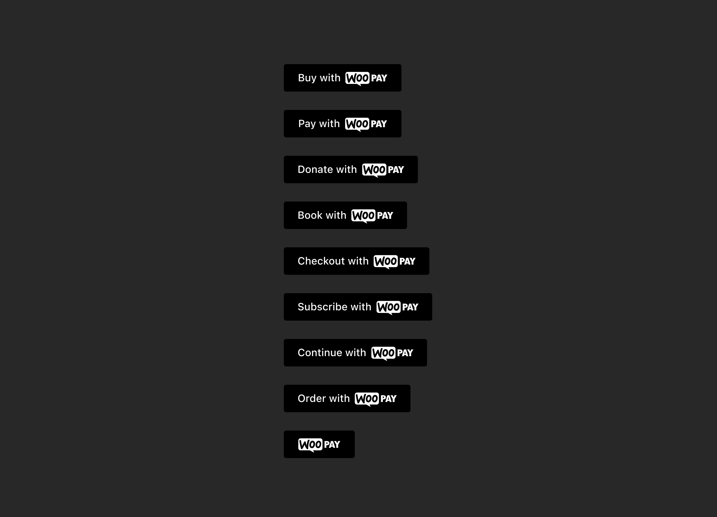
Provide variant buttons to accommodate merchant needs and payment experiences.
|
|
Buy
|
|
Pay
|
|
Donate
|
|
Book
|
|
Checkout
|
|
Subscribe
|
|
Continue
|
|
Order
|
|
Icon only
|
|
|
|
The button label should appear in sentence case, with only the first letter of the first word capitalized.
|
|
|
|
|