91 lines
3.7 KiB
Markdown
91 lines
3.7 KiB
Markdown
# Cart and Checkout Blocks Theming <!-- omit in toc -->
|
|
|
|
## Table of Contents <!-- omit in toc -->
|
|
|
|
- [Buttons](#buttons)
|
|
- [Mobile submit container](#mobile-submit-container)
|
|
- [Item quantity badge](#item-quantity-badge)
|
|
|
|
## Buttons
|
|
|
|
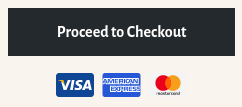
WC Blocks introduces the button component, it differs from a generic `button` in that it has some default styles to make it correctly fit in the Blocks design.
|
|
|
|
|
|
|
|
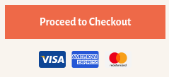
Themes can still style them to match theme colors or styles as follows:
|
|
|
|
```css
|
|
.wc-block-components-button {
|
|
background-color: #d5502f;
|
|
color: #fff;
|
|
/* More rules can be added to modify the border, shadow, etc. */
|
|
}
|
|
/* It might be needed to modify the hover, focus, active and disabled states too */
|
|
```
|
|
|
|
|
|
|
|
Notice the button component doesn't have the `.button` class name. So themes that wrote some styles for buttons might want to apply some (or all) of those styles to the button component as well.
|
|
|
|
## Mobile submit container
|
|
|
|
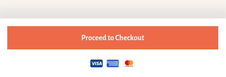
In small viewports, the Cart block displays the _Proceed to Checkout_ button inside a container fixed at the bottom of the screen.
|
|
|
|
|
|
|
|
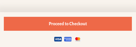
By default, the container has a white background so it plays well with the button component default colors. Themes that want to apply the same background color as the rest of the page can do it with the following code snippet:
|
|
|
|
```css
|
|
.wc-block-cart__submit-container {
|
|
background-color: #f9f4ee;
|
|
}
|
|
```
|
|
|
|
Take into consideration the container has a top box shadow that might not play well with some dark background colors. If needed, it can be modified directly setting the `color` property (internally, shadow color uses `currentColor`, so it honors the `color` property):
|
|
|
|
```css
|
|
.wc-block-cart__submit-container::before {
|
|
color: rgba( 214, 209, 203, 0.5 );
|
|
}
|
|
```
|
|
|
|
Alternatively, themes can override the `box-shadow` property completely:
|
|
|
|
```css
|
|
.wc-block-cart__submit-container::before {
|
|
box-shadow: 0 -10px 20px 10px rgba( 214, 209, 203, 0.5 );
|
|
}
|
|
```
|
|
|
|
|
|
|
|
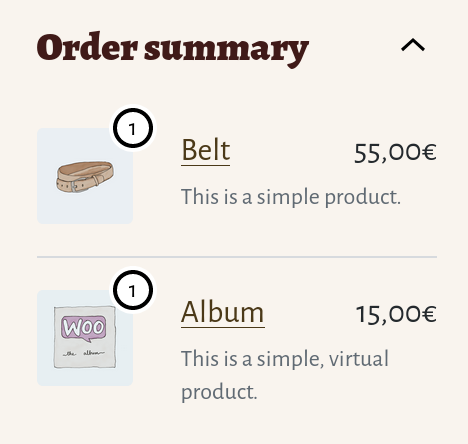
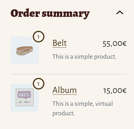
## Item quantity badge
|
|
|
|
The item quantity badge is the number that appears next to the image in the _Order summary_ section of the _Checkout_ block sidebar.
|
|
|
|
|
|
|
|
By default, it uses a combination of black and white borders and shadows so it has enough contrast with themes with light and dark backgrounds. Themes can modify the colors with their own palette with a single CSS selector and four properties. For example:
|
|
|
|
```css
|
|
.wc-block-components-order-summary-item__quantity {
|
|
background-color: #f9f4ee;
|
|
border-color: #4b3918;
|
|
box-shadow: 0 0 0 2px #f9f4ee;
|
|
color: #4b3918;
|
|
}
|
|
```
|
|
|
|
|
|
|
|
<!-- FEEDBACK -->
|
|
|
|
---
|
|
|
|
[We're hiring!](https://woocommerce.com/careers/) Come work with us!
|
|
|
|
🐞 Found a mistake, or have a suggestion? [Leave feedback about this document here.](https://github.com/woocommerce/woocommerce-blocks/issues/new?assignees=&labels=type%3A+documentation&template=--doc-feedback.md&title=Feedback%20on%20./docs/designers/theming/cart-and-checkout.md)
|
|
|
|
<!-- /FEEDBACK -->
|
|
|