37 lines
1.7 KiB
Markdown
37 lines
1.7 KiB
Markdown
---
|
|
post_title: User Experience Guidelines - Payment Button Layout
|
|
menu_title: Payment Button Layout
|
|
---
|
|
|
|
Define the position and alignment of buttons in relationship to their container, with equal hierarchy and consistent spacing between buttons.
|
|
|
|
### Product pages
|
|
|
|
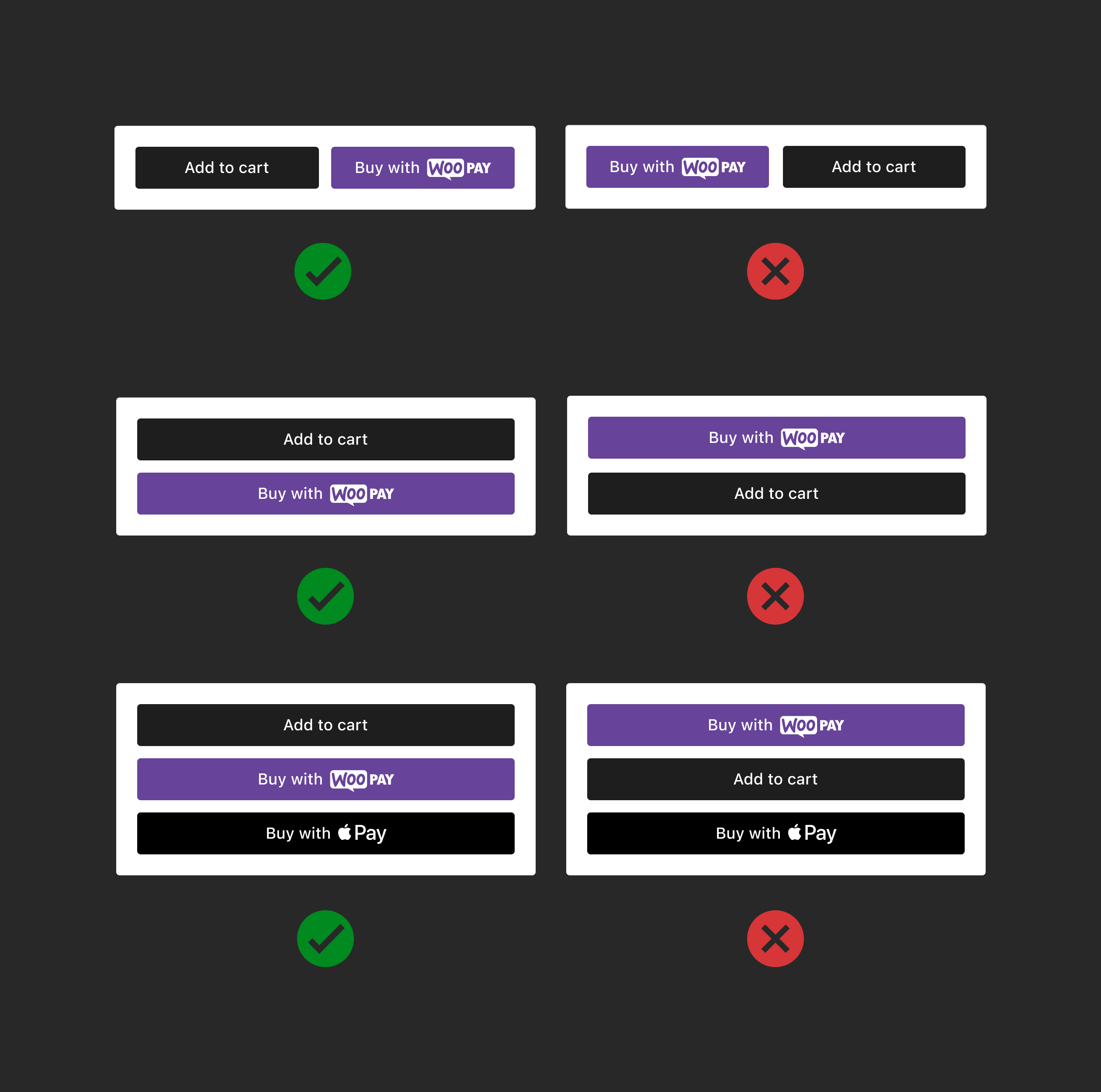
Position payment buttons correctly in relation to "Add to Cart" in horizontal or vertical layout, place payment buttons to the right of or below the "Add to Cart" button.
|
|
|
|
|
|
|
|
### Cart
|
|
|
|
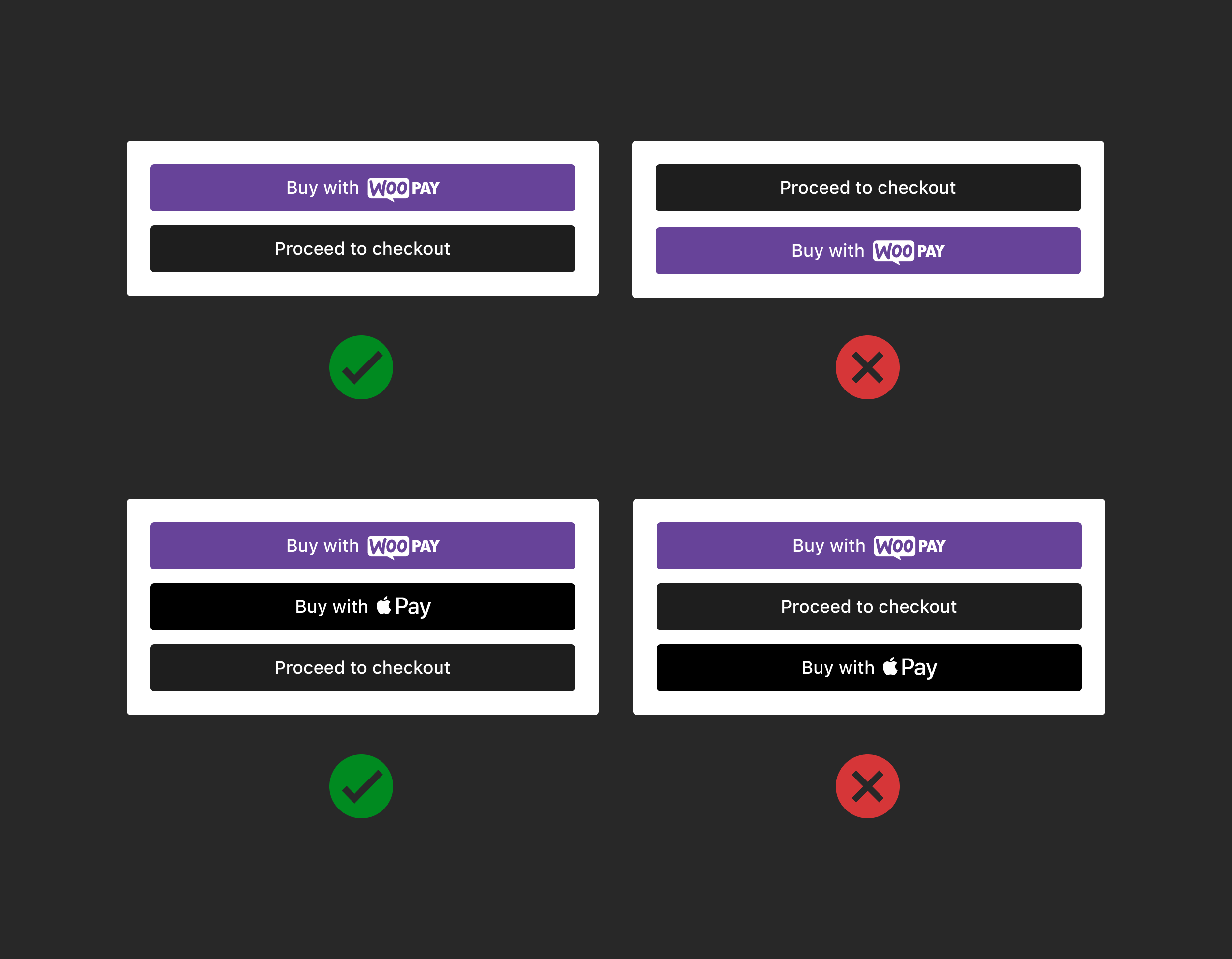
Position payment buttons correctly in relation to "Proceed to checkout" buttons in vertical layout. Place payment buttons above the "Proceed to checkout" button. Do not place payment buttons below the button or in between.
|
|
|
|
|
|
|
|
### Express checkout
|
|
|
|
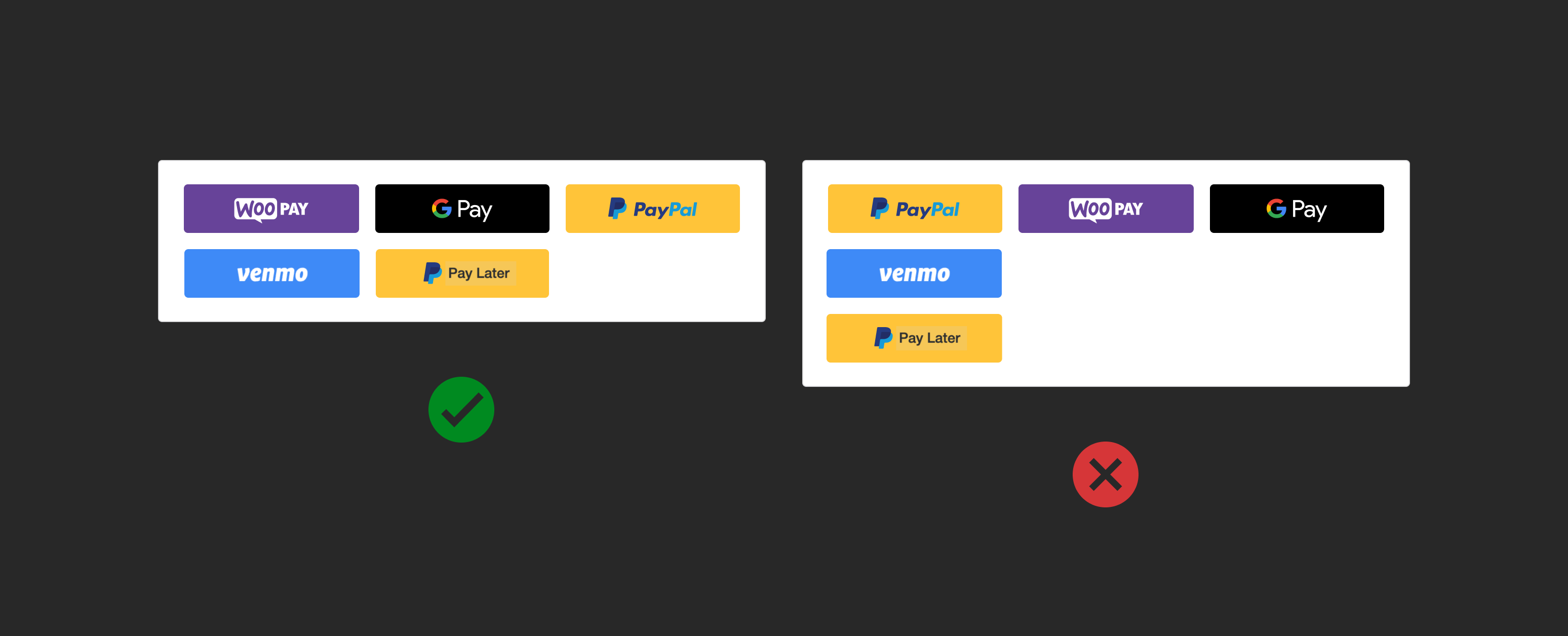
Position payment buttons correctly in horizontal layout, consistent in size and spacing. If a second row is required, left-align the buttons.
|
|
|
|
|
|
|
|
### Mobile view
|
|
|
|
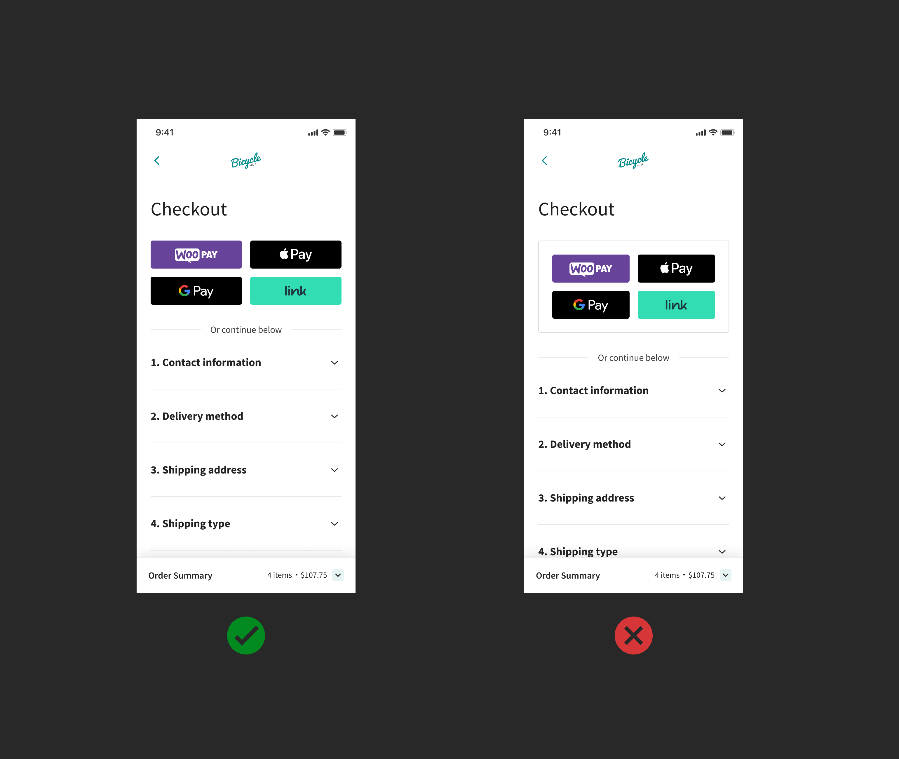
Express payment buttons on mobile should occupy the full width. Don't use the express payment border as it reduces the view area.
|
|
|
|
|
|
|
|
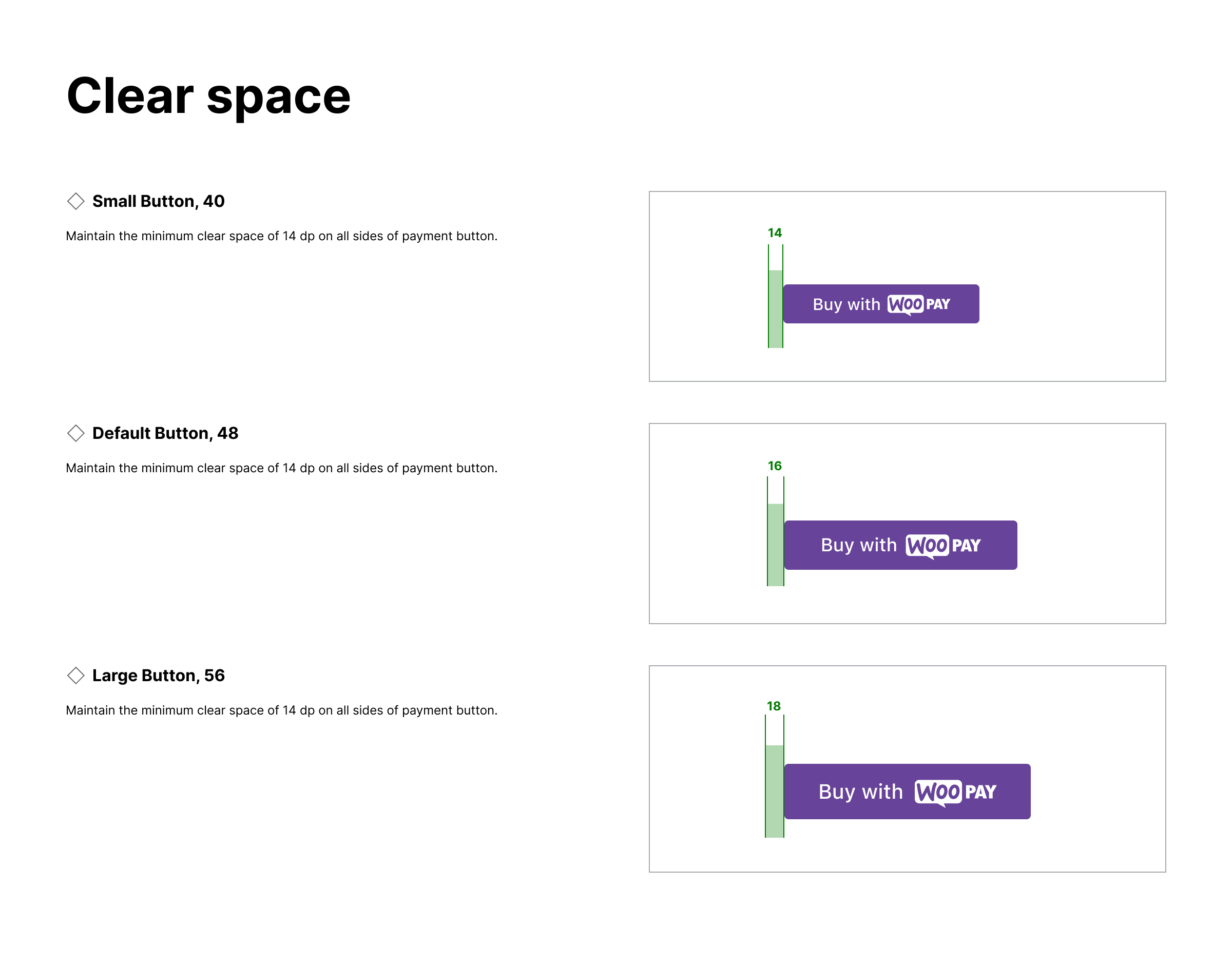
### Clear space
|
|
|
|
Maintain the minimum amount of clear space on all sides of the payment button. The clear space adapts based on the size of the button.
|
|
|
|
|