1.3 KiB
1.3 KiB
| post_title | menu_title |
|---|---|
| User Experience Guidelines - Payment Button Style | Payment Button Style |
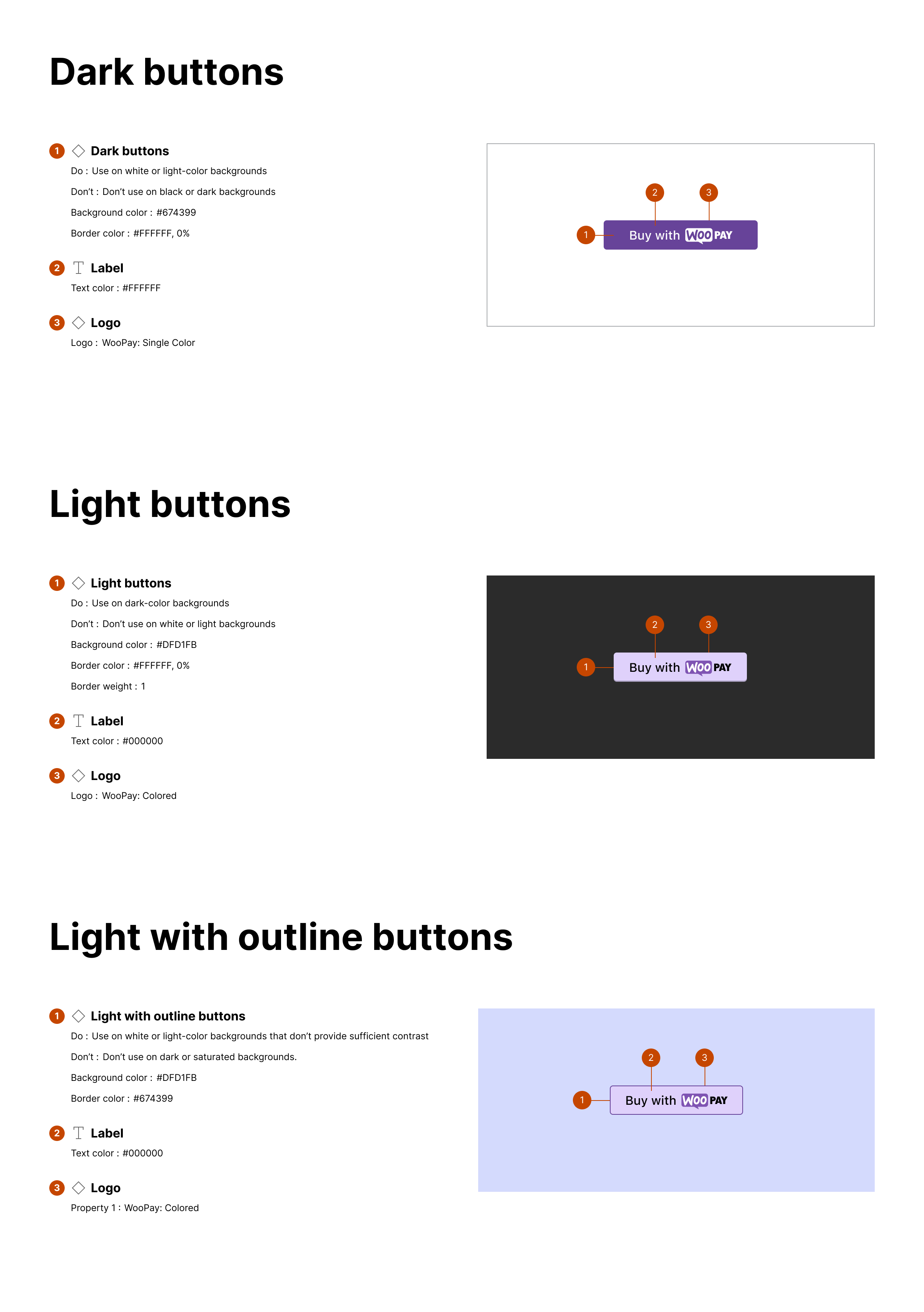
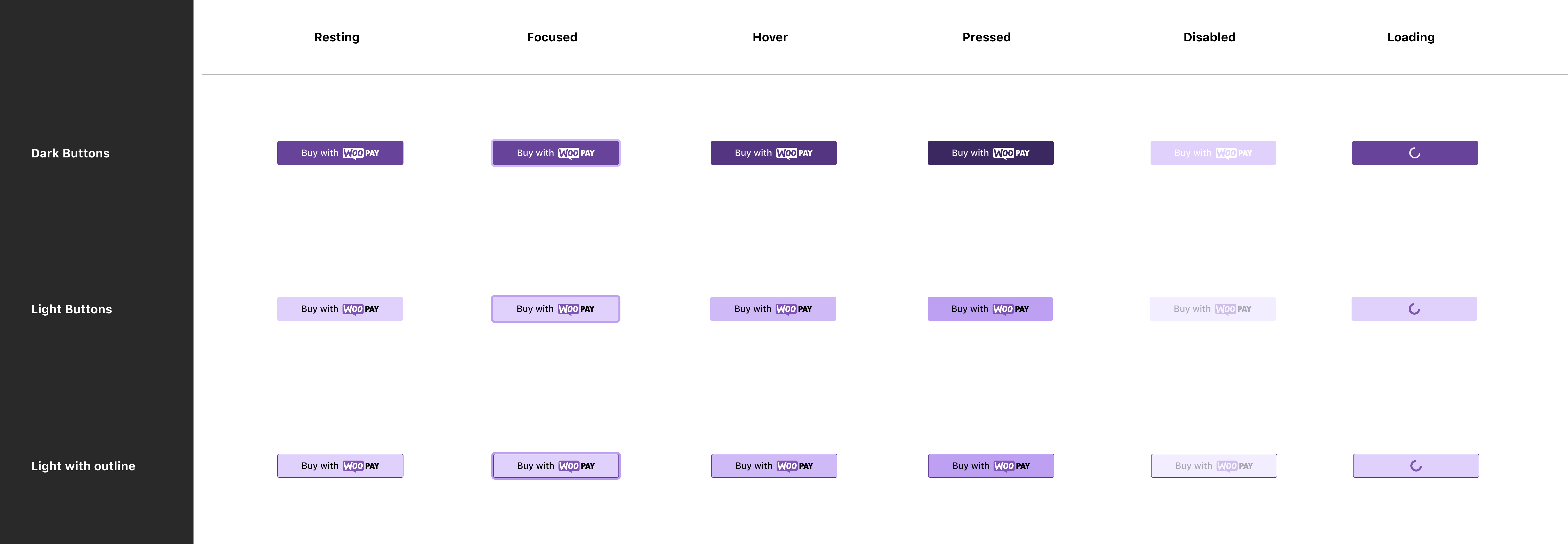
Use the appropriate button style depending on the site theme.
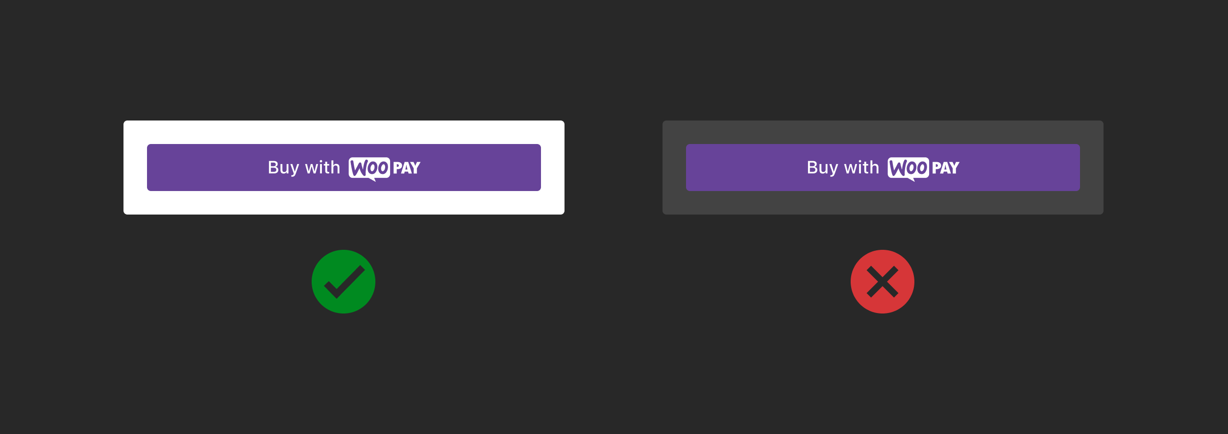
Dark
Use on white or light-color backgrounds. Don't use on black or dark backgrounds.
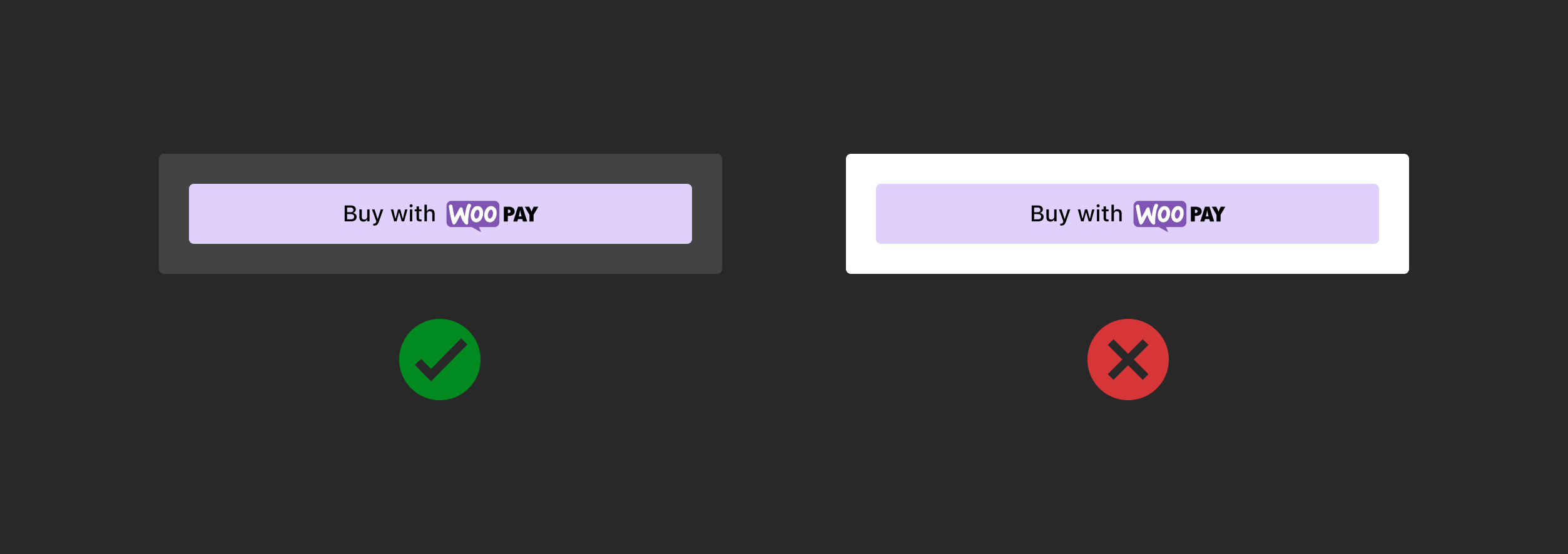
Light
Use on dark-color backgrounds. Don't use on white or light backgrounds.
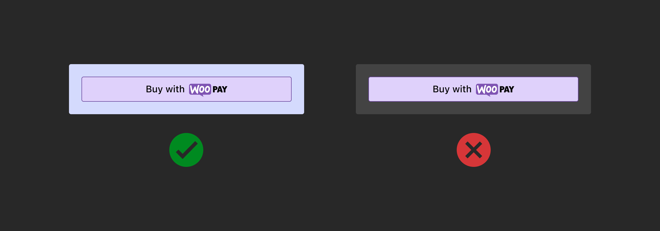
Light with outline
Use on white or light-color backgrounds that don't provide sufficient contrast. Don't use on dark or saturated backgrounds.
Button style and specifications
Buttons should contain the following states for resting, loading, active, and loading contexts. For additional guidance, follow the general Woo accessibility guidelines.
